I didn't know where to look at first and where to start.
I know that each trend is going to be different in the year but they can link slightly. I also know that from researching into previous trends the S/S' season's that they have a similar pattern. So I decided to look into what may be the next common theme.This is explained in the following blog entry.
I looked into a different city, Birmingham and saw a few things that inspired me. As it was my home town it was easy to visit and I knew where to look. First of all was the impressive Selfridge's building, this could be viewed as a work of art or a monstrosity.


I decided to write down a list of things that had circles within them which I thought was interesting.
- The Olympics - I knew that this was going to be an important event to the UK this year and could influence the way fashion and design could go. The Olympic rings are made up of five circles interlocking and represent how countries unite and come together for something important. I wanted to draw upon this 'all is one' theory and use it within my designs.

- I looked into architecture- As the Bullring first inspired me I decided to look further into British architecture and see where it would take me. I found lots of structures that also took a rounded shape. These are just a few that I drew upon from just Birmingham.
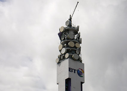
This is the BT Tower the tallest building within the city. Coincidently it has a top made of lots of circles. Although they are lined in rows they vary in shapes, sizes and colour showing a sporadic pattern.

This is the Rotunda, a building right in the centre of the city, a building full of apartments fit for a true shopper who likes to be in the middle of everything that is happening around them. This is a new iconic building to Birmingham, a building that fits in with the rounded theme.
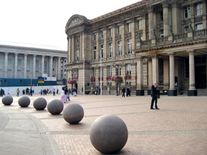
Although the purpose of the image is the Council House which is very grand, the solid concrete balls laid in a row in front of the building caught my eye. The idea that although spheres do not have an edge, they can still be put in rows to create one.
I then went to look into other British architecture that was iconic and also rounded in shape.
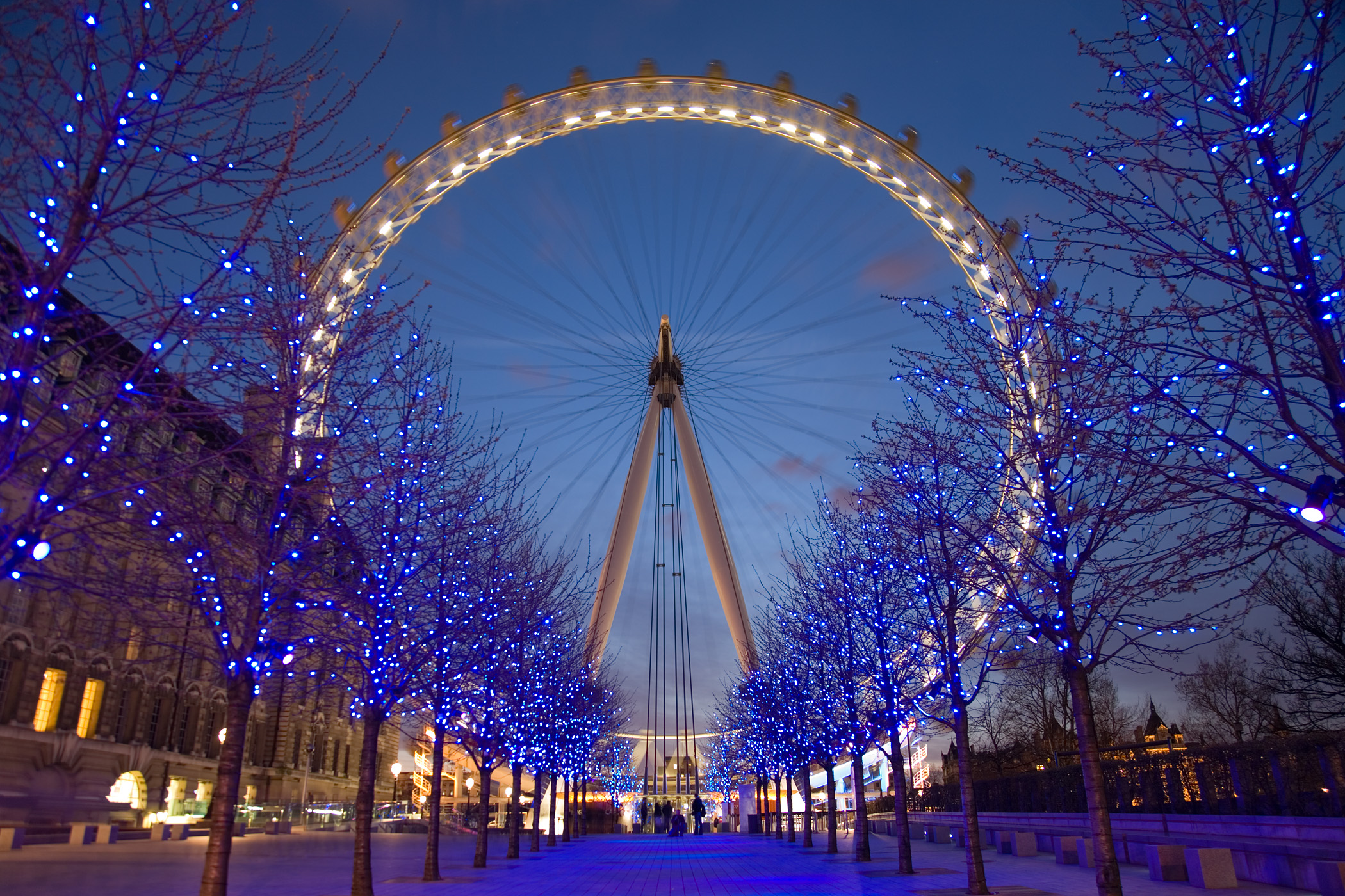
The obvious London Eye, a perfect circle which is recognised globally.
As I was looking back at London I decided to re-evaluate what I had already seen and taken photographs of. I did notice a common rounded theme running through my images.


Although there is no solid circles, when looking at this image of London I was attracted to the sunlight bubbles that have been captured in a row on the photograph. I like the semi transparent look and way that there is still something going on underneath.


From here I wanted to look into natural patterns, patterns in nature and patterns formed randomly.


This then lead me to look at a book called 'Walking in Circles' by Richard Long.
His book shows his journey across the world. He creates and documents shapes in particular circles that appear in nature and that he has created using natural products. The book documents his journey, his thoughts and sights along the way. These are just a few of the images from the book.
Although this is not a photograph, it is a mind map of everything he saw whilst in Scotland. I like the simplicity of the mind map but still forming a shape to create an interesting way of reading a piece of text.
This is another way Richard has arranged words to assemble a circle of his sights and story of his walk whilst on a 8 day walk in the Hexie mountains. It is more of an interactive and interesting way of reading something which I will consider when arranging my text for my trend explaination.
His book shows his journey across the world. He creates and documents shapes in particular circles that appear in nature and that he has created using natural products. The book documents his journey, his thoughts and sights along the way. These are just a few of the images from the book.
 |
| page 90 |
 |
| page 135 |
 |
| page 70 |
 |
| page 124 |
This is a piece of art created due to a journey. He has used mud to create this rounded piece but it is made up of many smaller imprints.
This is a photograph of somewhere in Mexico where Richard visited. I like the way that altough there is a clear circle which has been formed it still fits in with the rest of the surroundings. I want my designs to show the theme but not detract from the natural beauty of the face.
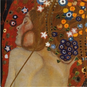
I also looked into the artist Gustav Klimt. The ideas in my head reminded me of some of his artwork which has circles within them. Some of his images feature beautiful women wrapped up in the background. They all look very relaxed and feminine looking giving off a very soft feel, something that I want to portray in my images. Here are a few which I particually like
They are all very romantic images with the women often looking like they are in love. I like this idea of having a loved theme to create a softer look. The circles and shapes that surround the women are detailed but do not over power her, she remains the main focus. The colours in the images are also rich but not too bright. They are not pastels but not intense shades. The images are very busy, I like some elements to the images but as a whole this would be too much for an image for my calendar. There is so much going on that you can study the images for a long time, I want one striking feature to my images.
COLOUR
Colour wise I wanted to reflect a lighter mood for Spring/Summer. Circles have no edges just a constant line which could go on and on. To me this creates a softer feeling which I think can be shown through colour.
The colour pallette that was seen in this image spurred me to select the colours I think work well with the trend. I particuarly like the blues, pinks, nudes and purples.


I also like the background colours of this image. They are all very soft and blend into one another. They are subtle with just hints of colour peering through. Again I like the way that there is still something shining through underneath.
I feel I now have a strong basis of research to now lead me on to creating my second trend forecast. Having such a strong first trend feels like I have now set the bar extremely high in creating further ones. I understand how to create them but I have found it more challenging to create. I believe this is because I have been lacking in my imaginative and inspiration skills. It was important to me to reference points from the UK as this is where I will be targeting my outcome. In order for the consumer to understand and relate to the trends I felt it was important for me to keep the focus on Britain. By me carrying out thorough research it not only allows me to put together a strong trend forecast but also evidence my investigation skills, proving that I have addressed the learning outcome ' Devise innovative and appropriate solutions to a specific styling problem or brief'.
 | |
| page 111 |
I also looked into the artist Gustav Klimt. The ideas in my head reminded me of some of his artwork which has circles within them. Some of his images feature beautiful women wrapped up in the background. They all look very relaxed and feminine looking giving off a very soft feel, something that I want to portray in my images. Here are a few which I particually like
 |
| Water Serpents II |
 |
| Acqua Mossa |
 |
| The Kiss |
 | ||||||
| Adele Bloch-Bauer II (1912) |
COLOUR
Colour wise I wanted to reflect a lighter mood for Spring/Summer. Circles have no edges just a constant line which could go on and on. To me this creates a softer feeling which I think can be shown through colour.
The colour pallette that was seen in this image spurred me to select the colours I think work well with the trend. I particuarly like the blues, pinks, nudes and purples.


I also like the background colours of this image. They are all very soft and blend into one another. They are subtle with just hints of colour peering through. Again I like the way that there is still something shining through underneath.
I feel I now have a strong basis of research to now lead me on to creating my second trend forecast. Having such a strong first trend feels like I have now set the bar extremely high in creating further ones. I understand how to create them but I have found it more challenging to create. I believe this is because I have been lacking in my imaginative and inspiration skills. It was important to me to reference points from the UK as this is where I will be targeting my outcome. In order for the consumer to understand and relate to the trends I felt it was important for me to keep the focus on Britain. By me carrying out thorough research it not only allows me to put together a strong trend forecast but also evidence my investigation skills, proving that I have addressed the learning outcome ' Devise innovative and appropriate solutions to a specific styling problem or brief'.
No comments:
Post a Comment